Standard Website Features
Every website we build gets what it needs to succeed.

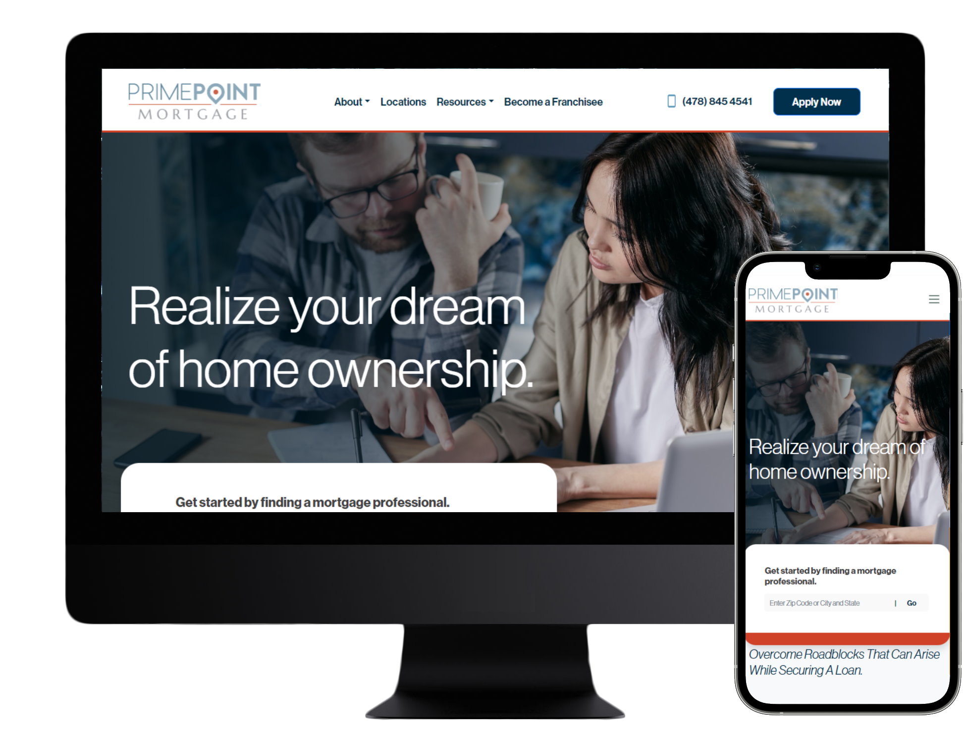
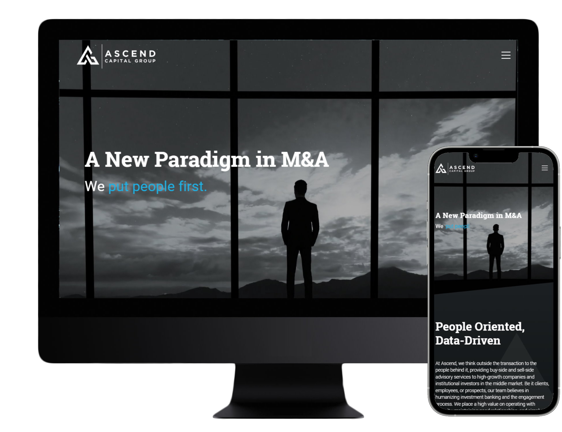
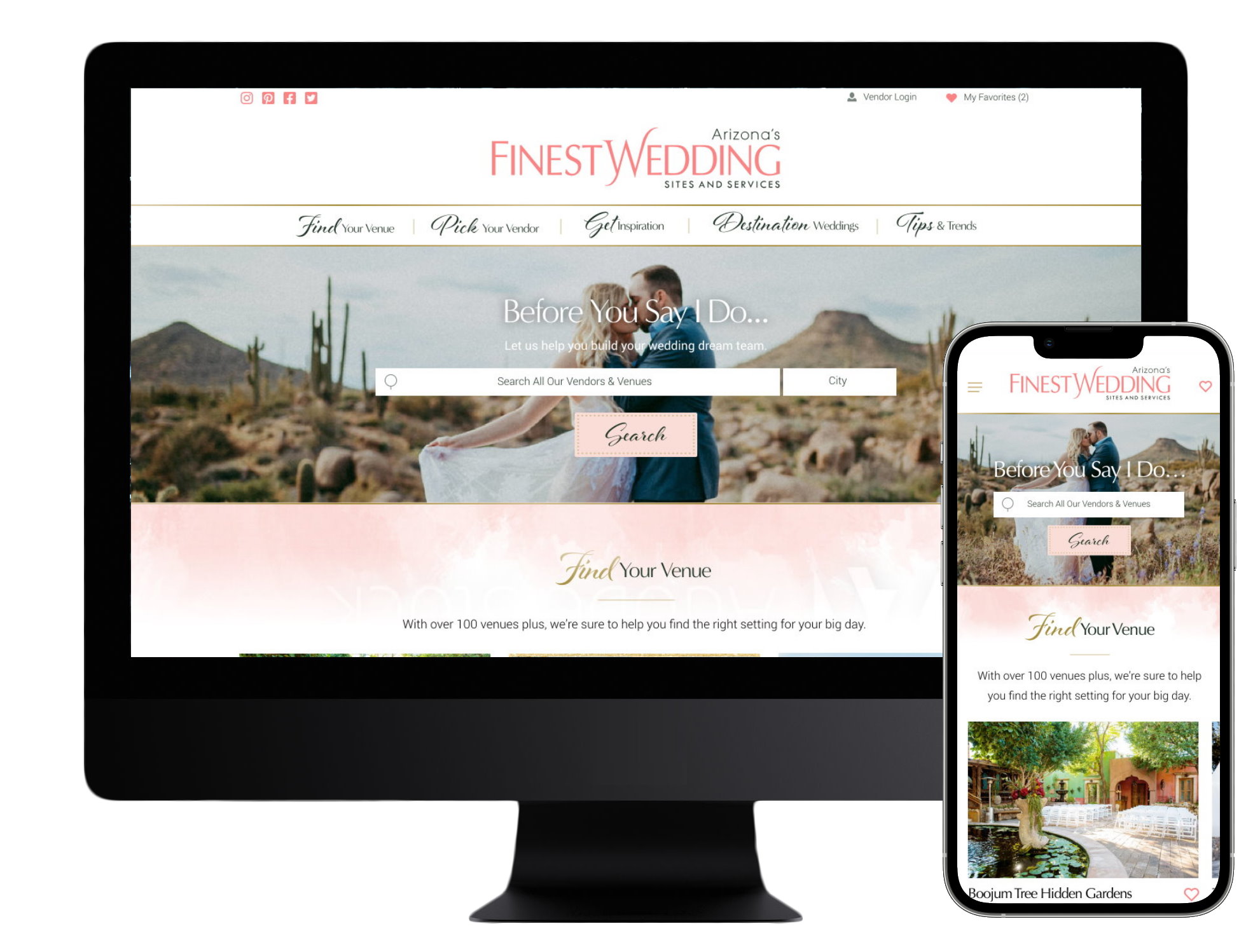
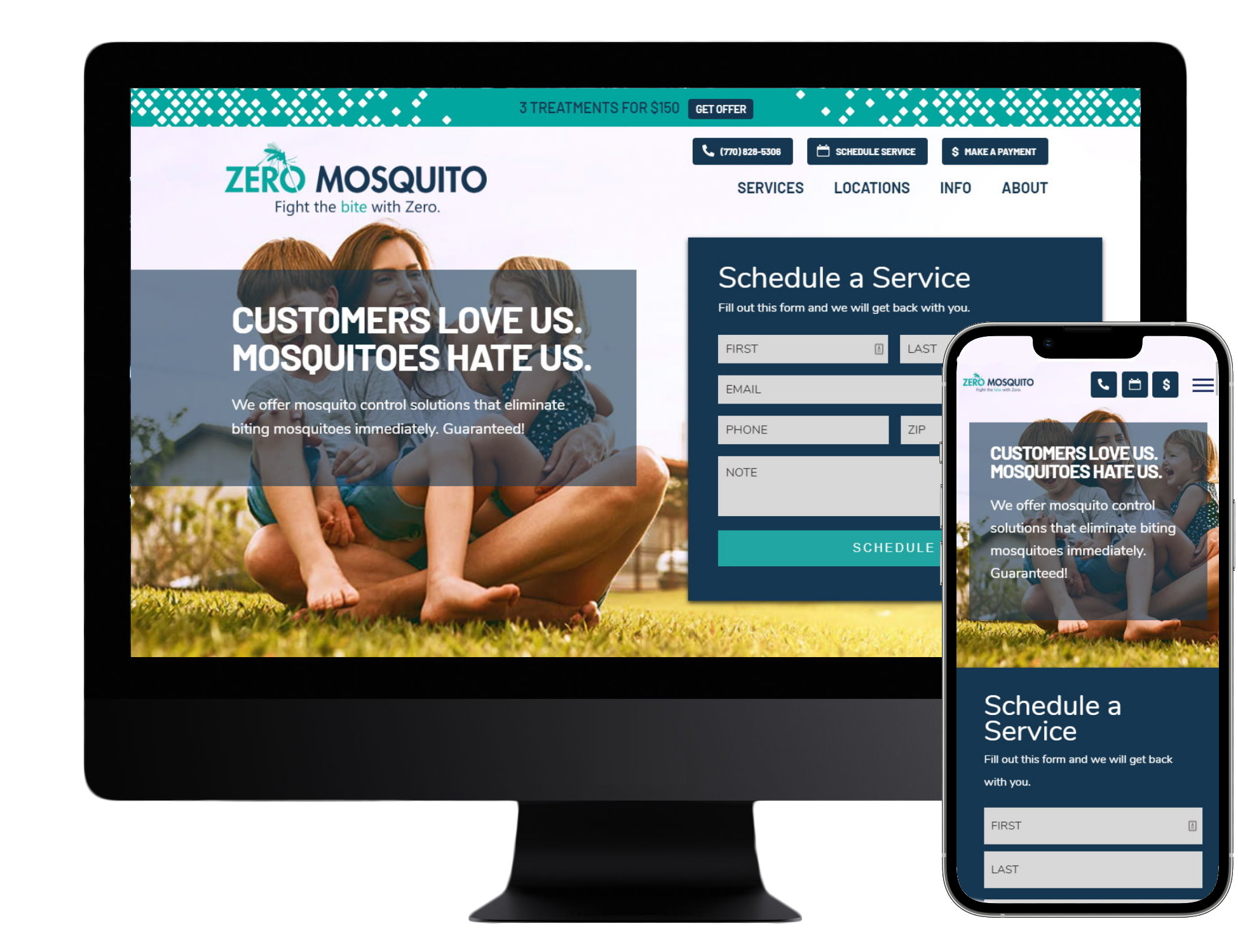
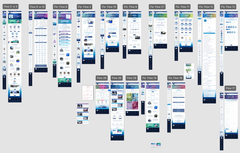
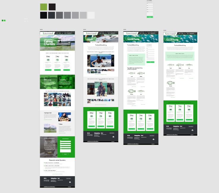
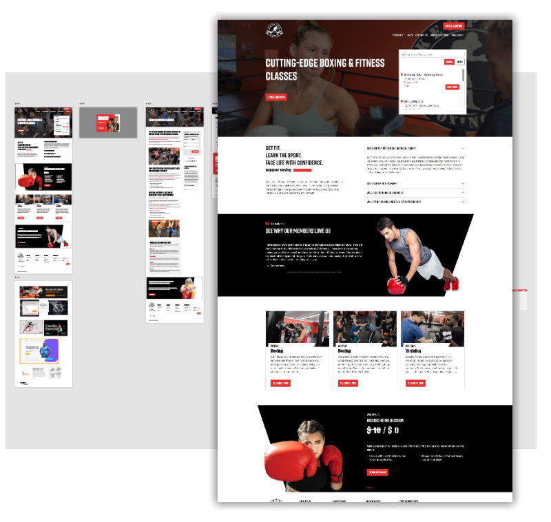
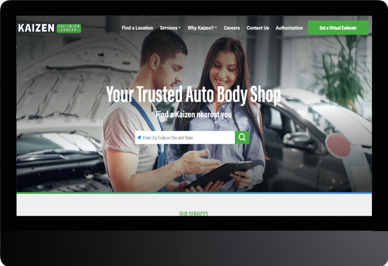
Custom Design
We don't start with a template. You get to meet with our team to craft your website vision and create something that is truly yours. We'll utilize your brand guidelines - or even help you create them.
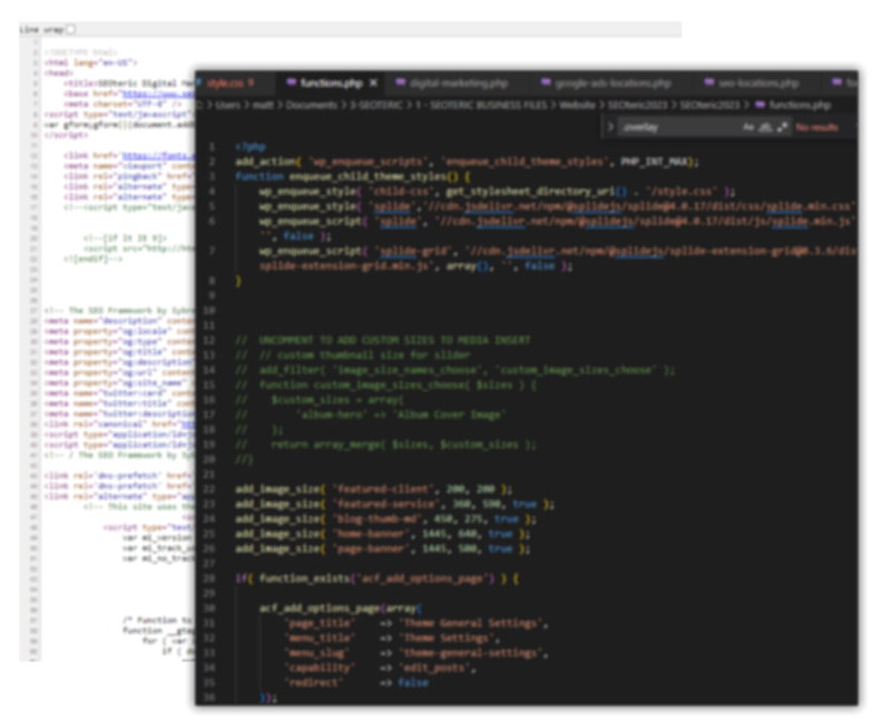
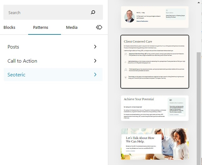
Content Management
At the core of every web project is the ability to manage content. We provide unique tooling with custom fields, blocks, and custom patterns to make content management easier, and keep it looking great.
Intelligent Administration
We take the time to create a simple solution for managing content that is more intuitive. You'll see custom fields and sections clearly labeled so you know what to edit, even in the more complex areas.
Modular Layouts
Since the rollout of WordPress Blocks, we've built more modular layouts, allowing you to drag and drop content, and place pre-designed blocks to add content where you need it. This give more content flexibility and design consistency.
Extensible Content
Managing existing content is important, but so is growing your content. You'll have the tools to add blog posts, pages, content sections, menu items, media and just about anything else you need to expand and extend your website content.
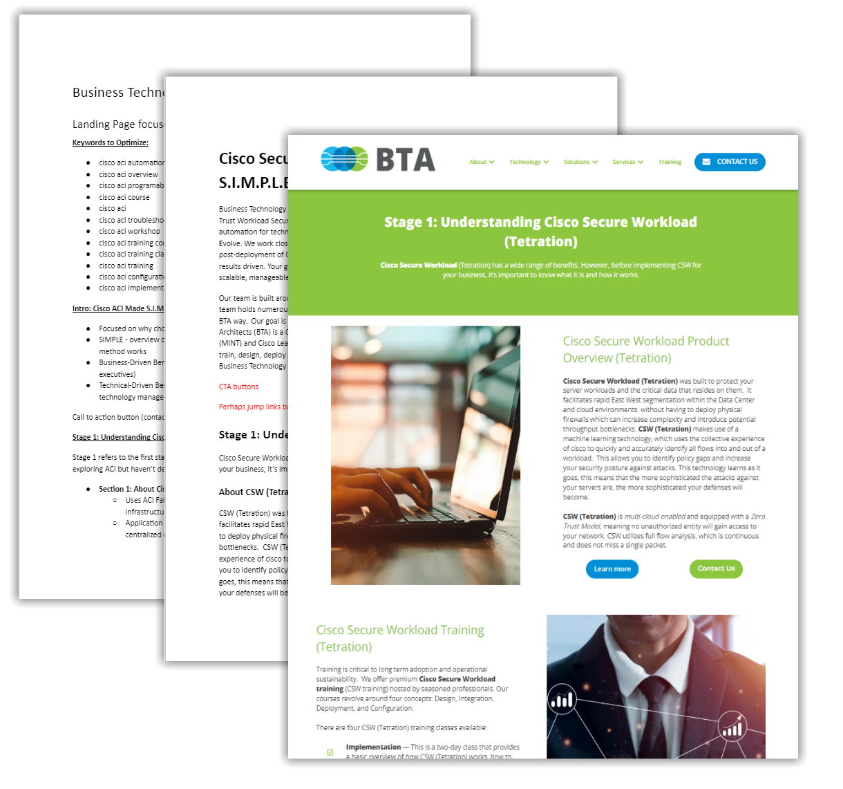
SEO Tooling
What would a website be without a way to optimize it for SEO? You'll have tooling to handle indexing, titles, meta data, analytics, and more. We provide baseline optimizations, but you'll have the tools to refine that (as will our team if we are managing SEO).
Lead Capture
Every website has a form, but we also make sure to capture leads in the database to retain the lead if email fails for any reason - so you won't miss any leads. Leads can be routed based on form fields, and you can edit and create forms as needed.
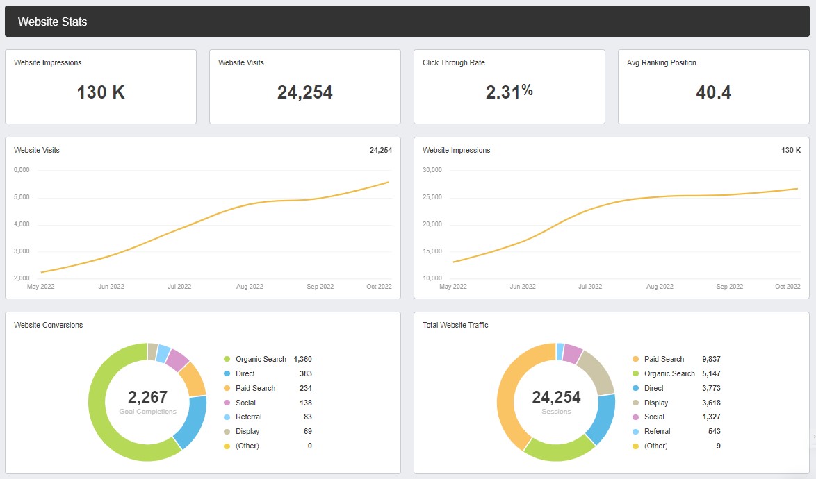
Google Analytics
Each website has the ability to connect Google Analytics (GA4) for tracking. We also include some out-of-the-box conversion tracking on forms and mobile phone calls so you can see how your website performs at converting visitors to sales and leads.
Premium Hosting
We give each website plenty of resources to perform well. Every new website hs its own technology "container" that's partitioned for both security and resource allocation. This mitigates a lot of issues with shared resources.


.png)